- NO BRIEF
- REBEL
- THE POINT
- THE GLYPH
- ABSORBS
- THE SKIN
- THE TYPEFACE
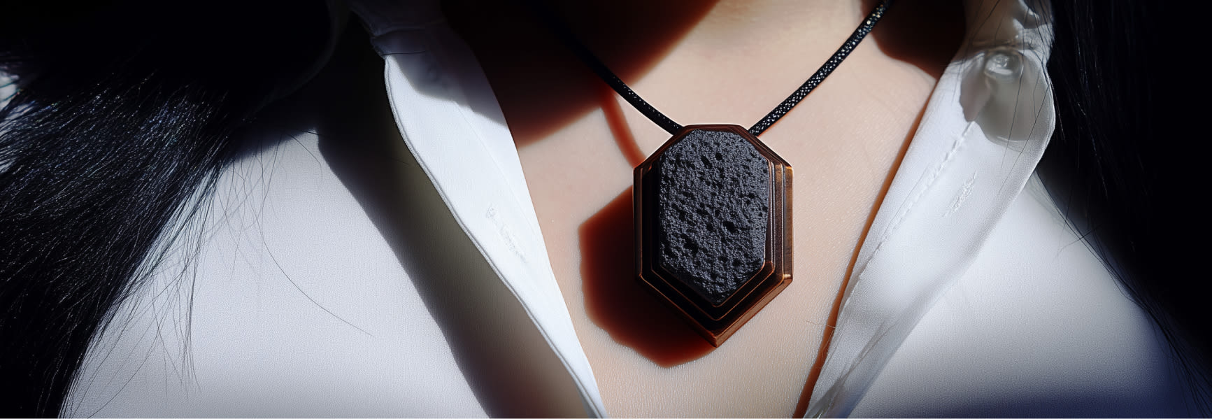
I built the client before building the brand.
No client, no constraints. The starting point was a person who did not yet exist.
Usually, a brief tells you who buys, why, and what they want to hear. Here, there was no brief. I had to build that person from scratch—give her a name, an age, a story, a reason to choose Eve instead of anything else. Only when that person was real enough to imagine her choices did I open Illustrator.
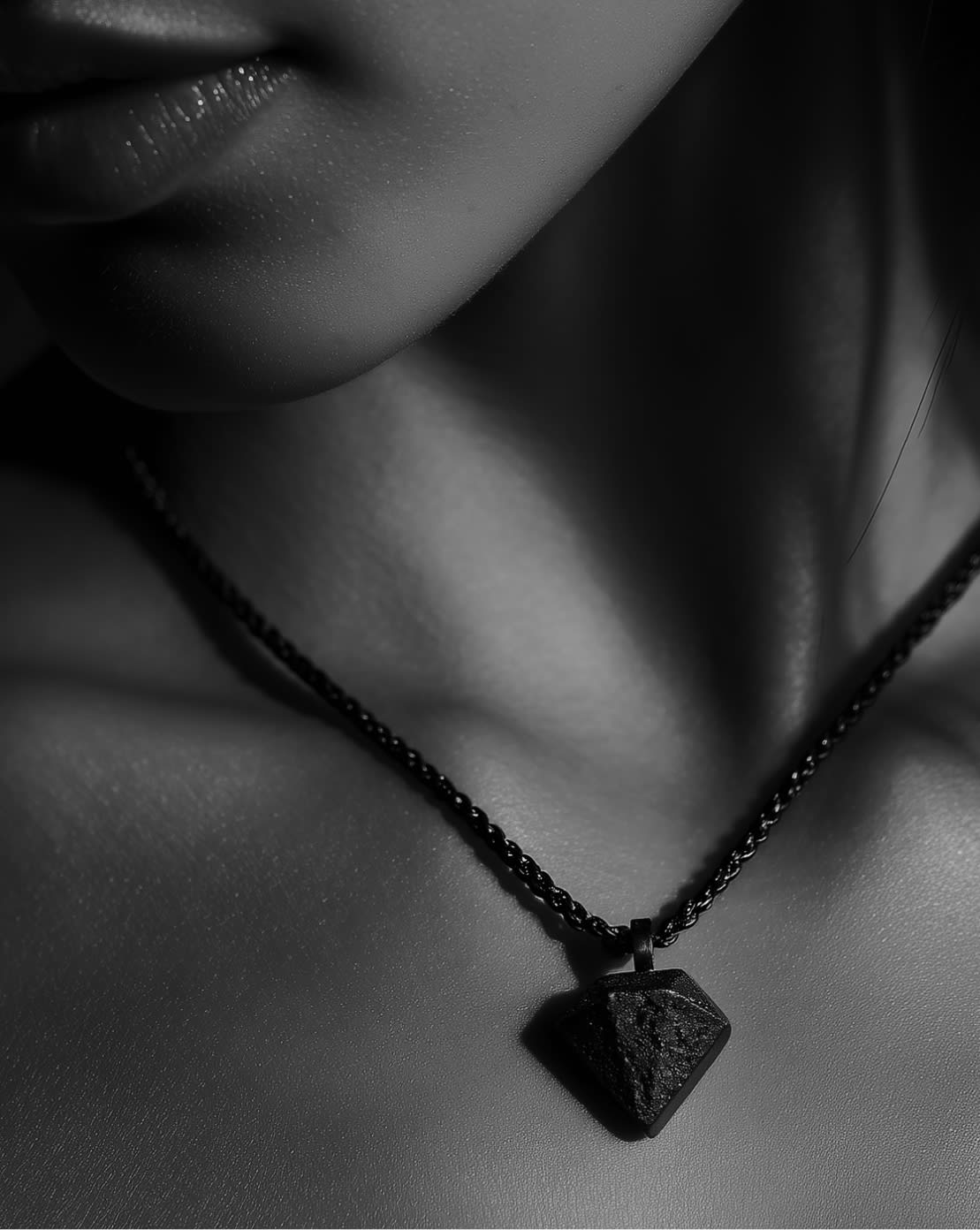
The wrong name was the right one
Luxury brands choose rare, unreachable names. I chose a name everyone already knows.
Eve is short, common, everyone knows it. But the symbolic weight is maximal: the first who dared, before anyone else, against the established order. It is not a docile name. That duality between formal lightness and conceptual gravitas is the same as the material: lava stone, born from the most intense fire, often light and porous. Character adds the layer that was missing: not what you wear, but who you are while wearing it.
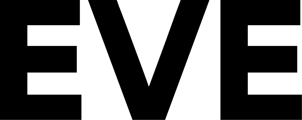
"EVE" is a name. "EVE." is a sentence
I looked for the minimal mark that would change everything. It was a point.
The letters have a precise, non-decorative constructive geometry. I resolved the structure first, then came coherence with the material. The period came last: a minimal choice that changes the reading of everything. From a name to a statement.

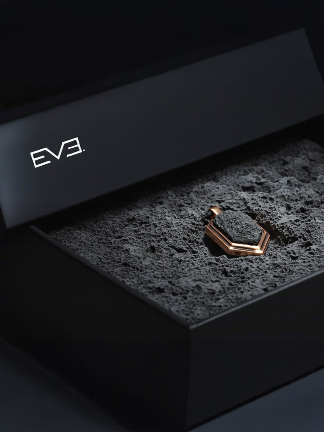
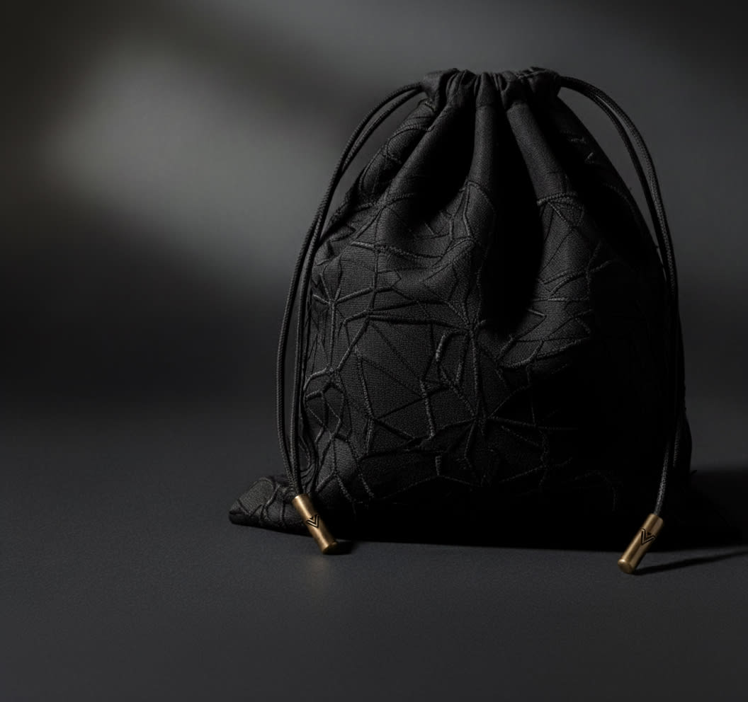
It is not the logo. It is the signature on the piece.
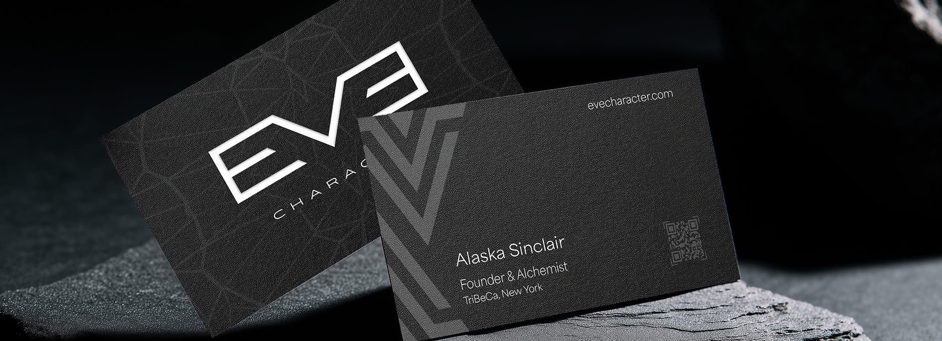
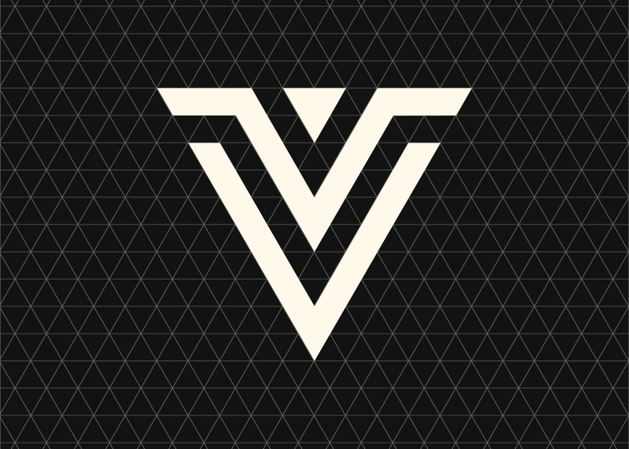
Every piece of jewelry needed a mark that was not the brand, but that said the piece was authentic.
The chevron derives from the V of the monogram, it is not a new element, it is the same system reduced to a single sign. It goes on the authenticity card and on the piece. Those who know the brand recognize it. Those who do not read it as a maker's mark. It works both ways.
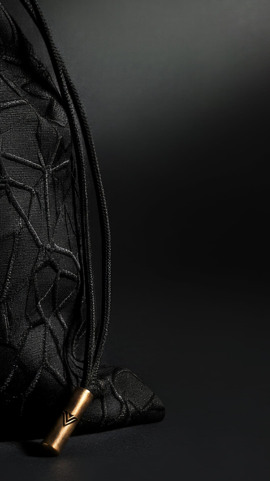
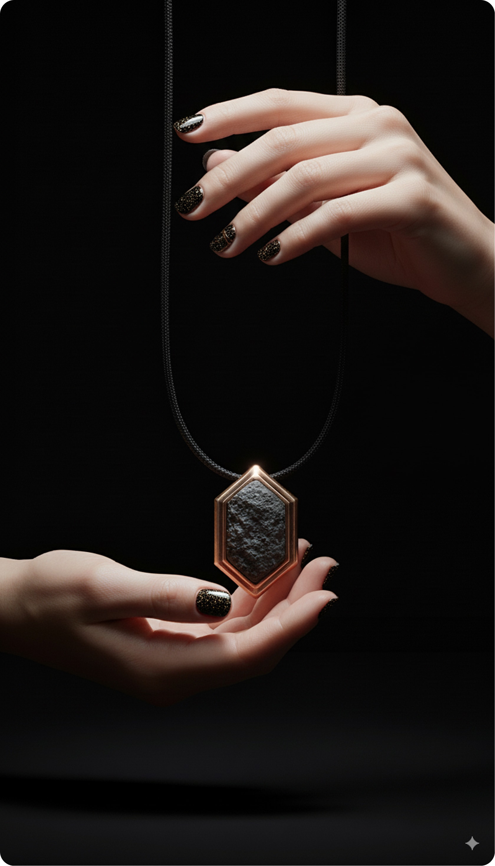
All luxury jewelry speaks of sparkle. Eve does not.
The open field was not in the product. It was in how it was told.
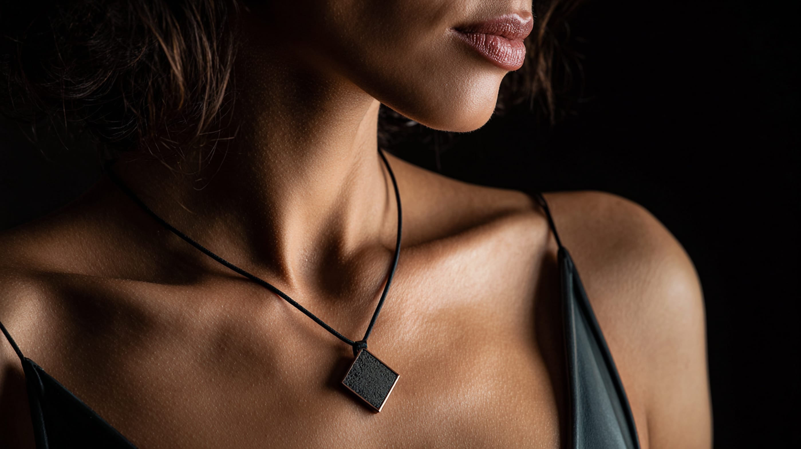
Cartier, Tiffany, Bulgari talk about light. About special occasions. About trophies to show off. I built the brand in the opposite direction, a piece of jewelry that does not exhibit, that absorbs. Lava stone does not shine. It was the right material for what I was building.
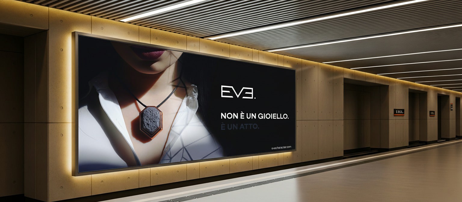
Photography is not style. It is a brand rule.
I wrote the rules before shooting. For anyone who will photograph Eve, not just for myself.
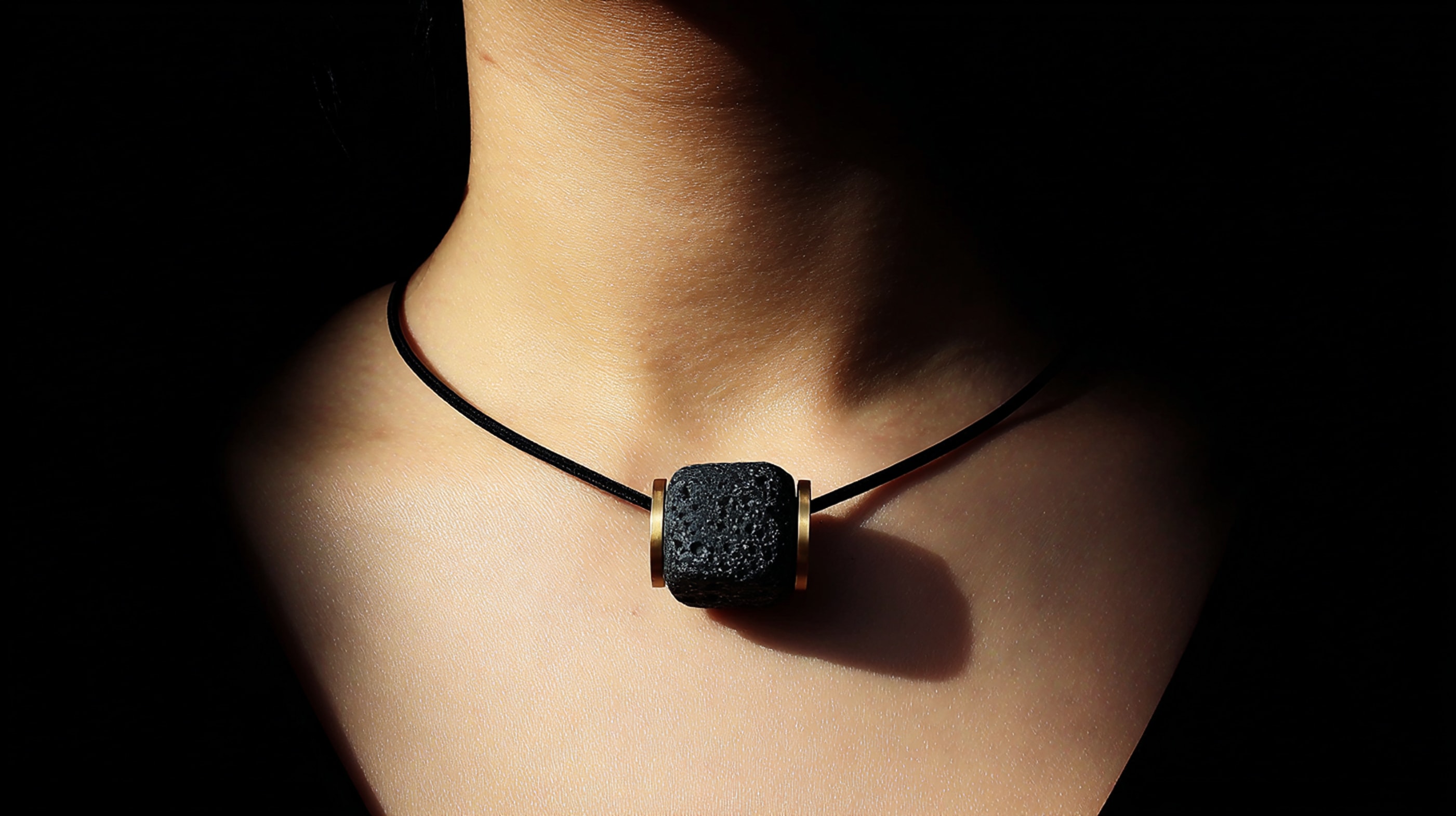
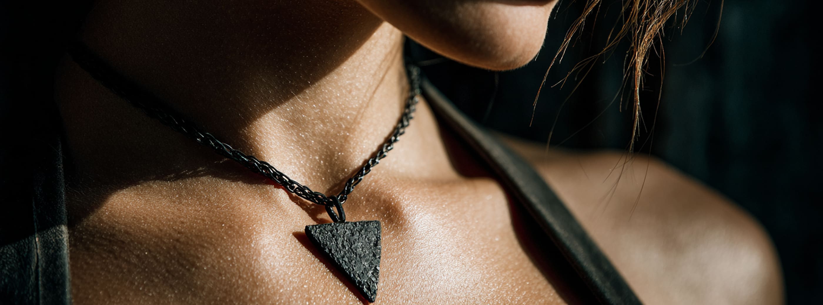
No bokeh, no diffused light, no fake textures. Just grazing light that digs into the reliefs of the stone. Tight crops, never full figure. The jewelry always in contact with the skin or the rock it comes from. It is not a photographic direction, it is a system that holds even when the photographer changes.
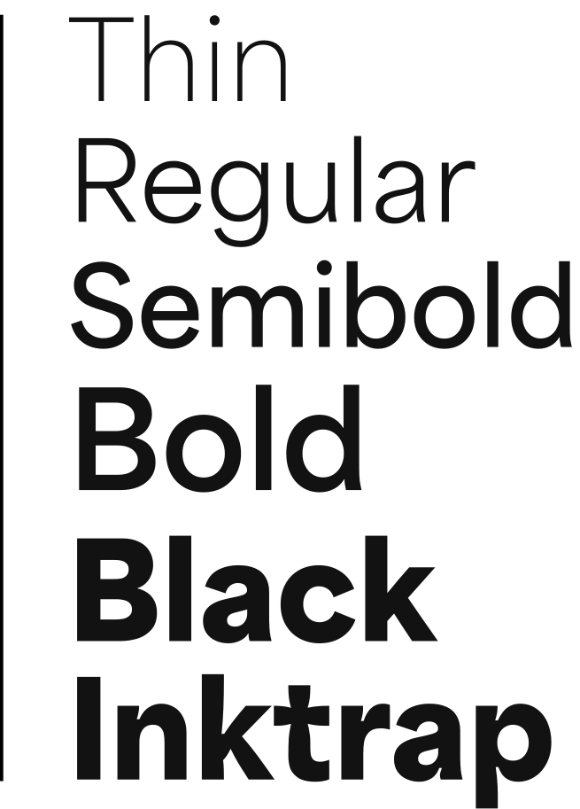
A font that changes weight without changing identity.
Area Variable was not the obvious choice for a jewelry brand. It was the right choice.
Most luxury brands use classic serif typefaces: elegant, definitive, always identical to themselves. Eve does the opposite: a variable sans-serif that bends between lightness and density within the same system. The same principle as lava stone: light or heavy, always the same substance. The typographic choice does not decorate the brand. It replicates it in letterform.
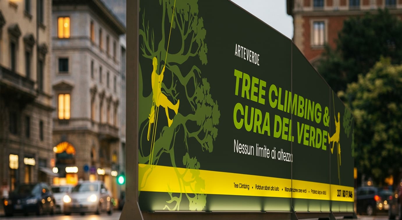
The van is still running. The banner holds. Trees that are too tall come down.
Arteverde