- SHOPPING LIST
- ONE SECOND
- TAILBACK
- WIDE BLACK
- NO GREEN
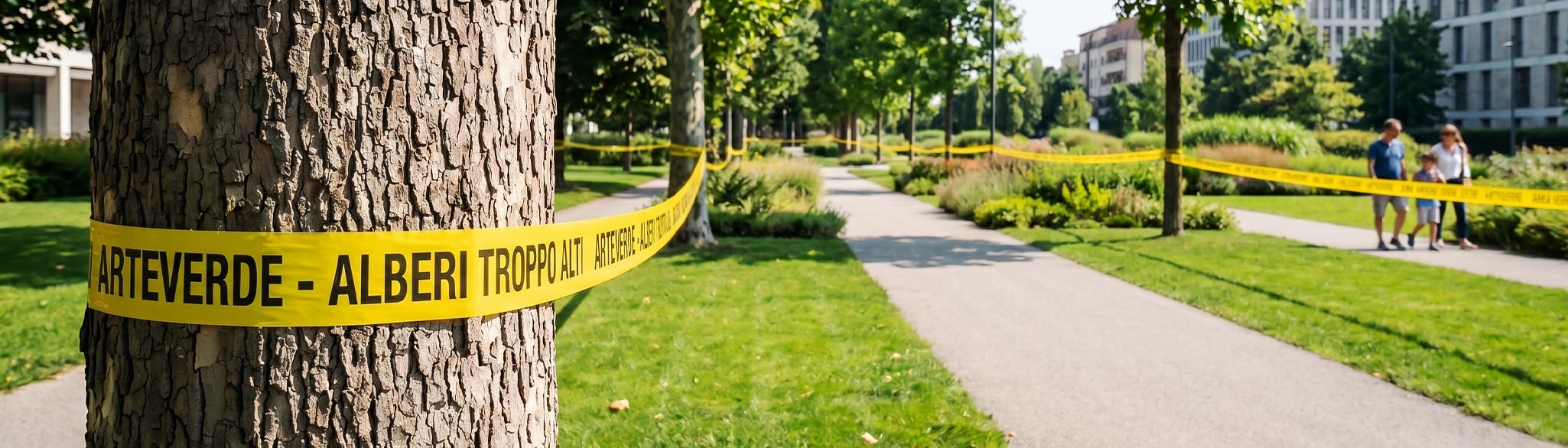
Five services in a row are not a strategy. They are a menu.
The client knew what he did. He didn't know what to communicate yet.
The brief was simple: logo and list of services. I asked why that list, in that order. The answer was the real brief: tree climbing wasn't just another service, it was the reason why it was worth calling him. I removed the list from the main hierarchy and built on top of it. The banner doesn't state what he can do.
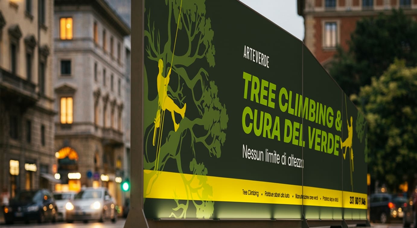
At fifty miles an hour you have one second. Either the message is there or it isn't.
The format is not an aesthetic constraint. It is a physical constraint.
400 × 90 centimeters on a moving vehicle. The reader is not stationary: they pass by, turn, move away. A list of four services requires at least five seconds of reading. Five seconds on a speeding van do not exist. The format already tells you what you can put in and what you must take out, even before opening Illustrator.
The back works when you are stationary. You have all the time you didn't have before.
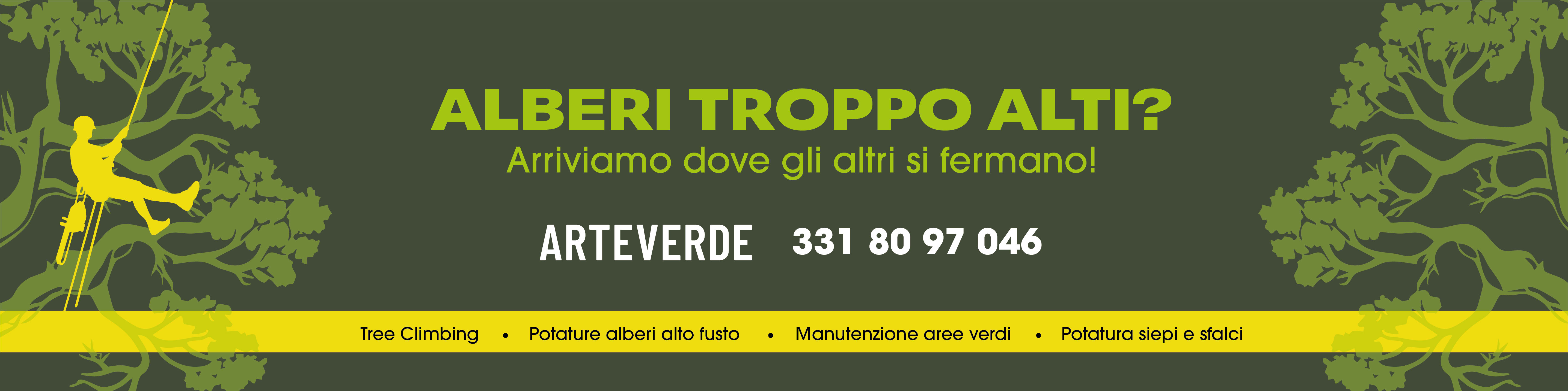
The back works when you are stationary. You have all the time you didn't have before.
The side panels declare who we are, what we do, call us. It is always visible, it has all the time in the world. The rear pane questions: do you have trees that are too tall? It doesn't say 'I do this'; it asks if you have that problem. Those who answer yes read the services, read the number, call. The communication is the same. The angle changes because the moment I find you changes.
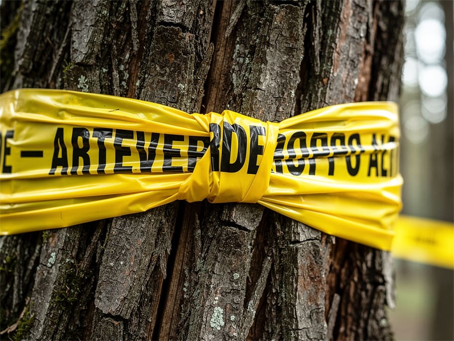


Not the font. The specific weight.
Wide Black is not an aesthetic option. It is the only weight that holds up at that distance.
Peridot exists in multiple variants. Wide Black is the one with the widest stems, the most open counters, the structure that doesn't close up when the character is large and distant. On a four-meter banner read from a speeding car, the weight of the font is a technical specification before it is a graphic choice.
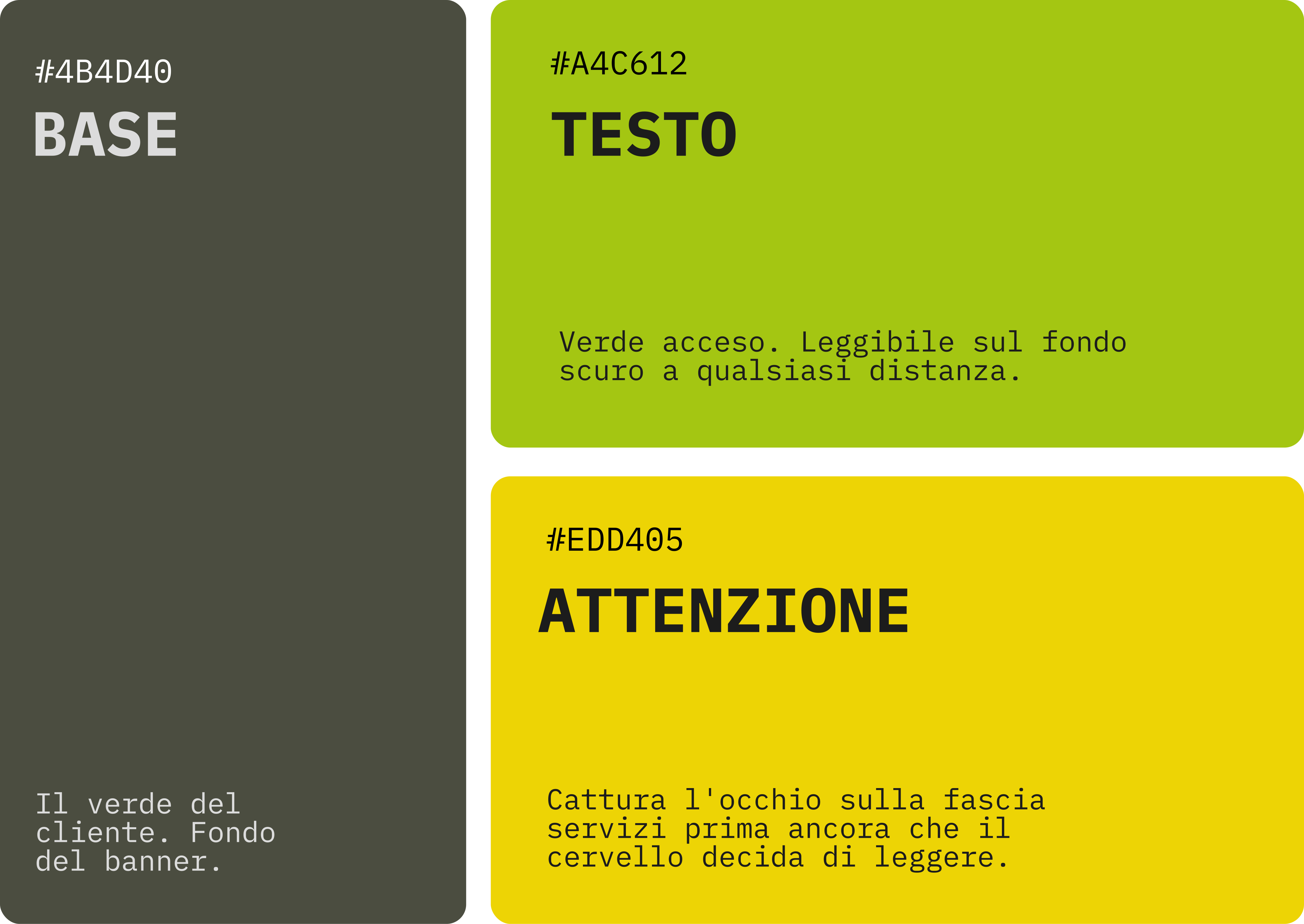
The client's green was not enough. We needed two more.
A single color on a banner to be read at a distance is not a palette. It's a problem.
The client had a dull military green—his own identity, untouchable as a base. But on an OOH banner read in motion, immediate contrast was needed. I added a bright leaf green for the texts, legible against the dark background at any distance. The yellow band at the bottom catches the eye on the services before the brain even decides to read. Three colors, three precise roles. None of them decorative.
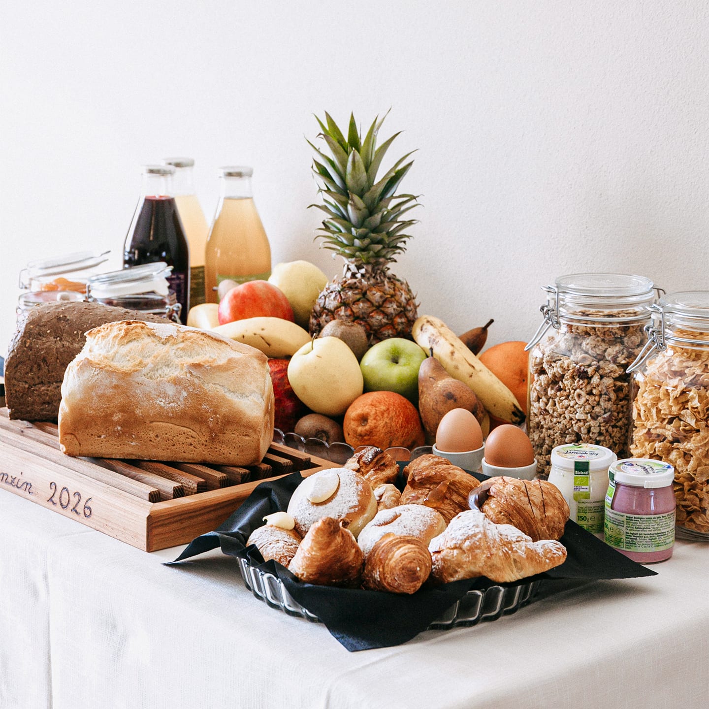
The website is online. Rooms are booked. Silence still sells.
Ca'Perenzin